Super App
Enhancing Homepage Diversity and Function
Microsoft Start provides users a familiar browser experience, with improved navigation, personalized features and the inclusion of a suite of mini-apps such as Weather, Shopping, Sports, Games, etc… The homepage design for this update is key in delivering the new experience.
My role
Explorations and design for homepage cards, homepage layout, and mini-app tiles. This work contributed to making the app more visually expressive, having visual coherence, being aligned across touchpoints, and making the app more consumer-friendly.
Collaborators
Lead design
Director
PM
Engineers
Platform
Android
IOS
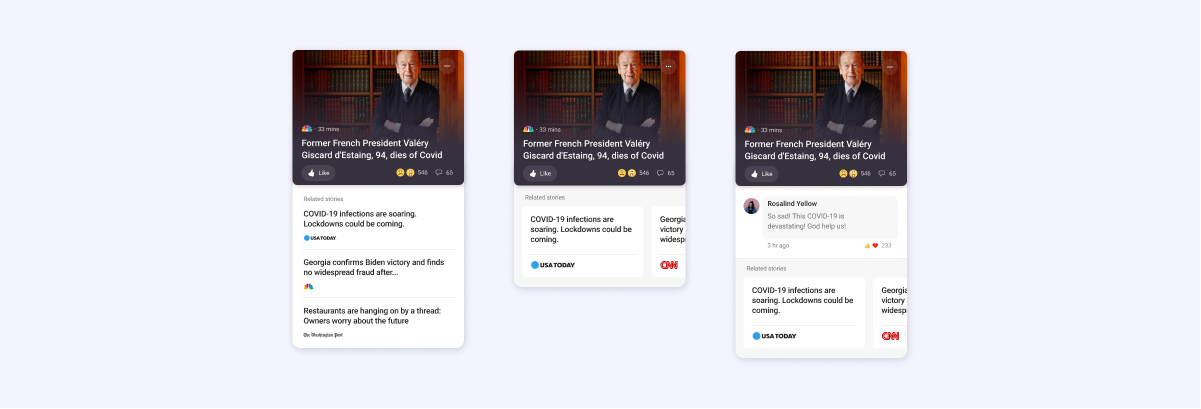
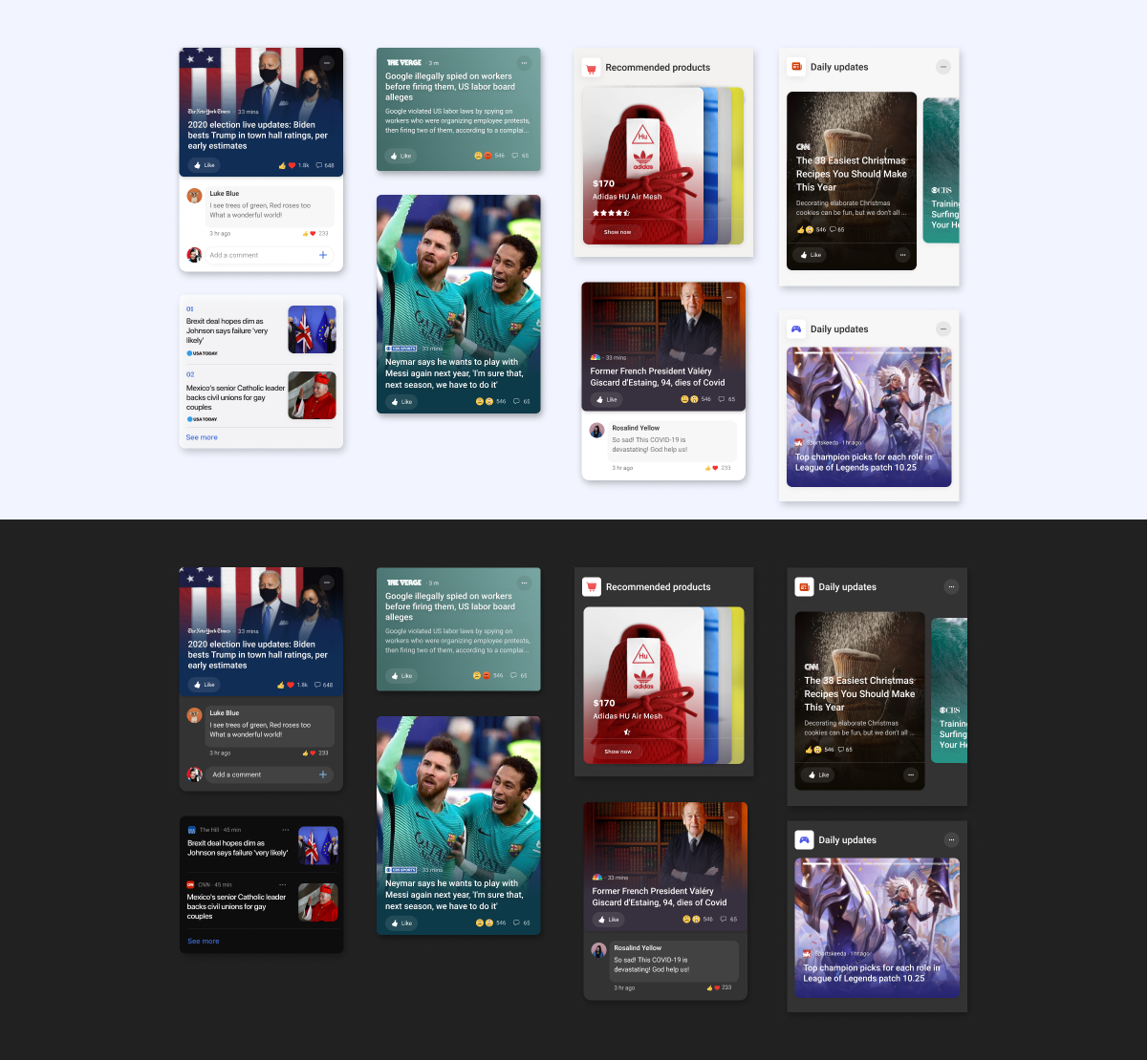
Goals for the cards were to be more visually expressive, including a variety of cards for different types of content, enhancing engagement via design for social media features for commenting and emoji engagement, as well as, alignment with the latest desktop browser.
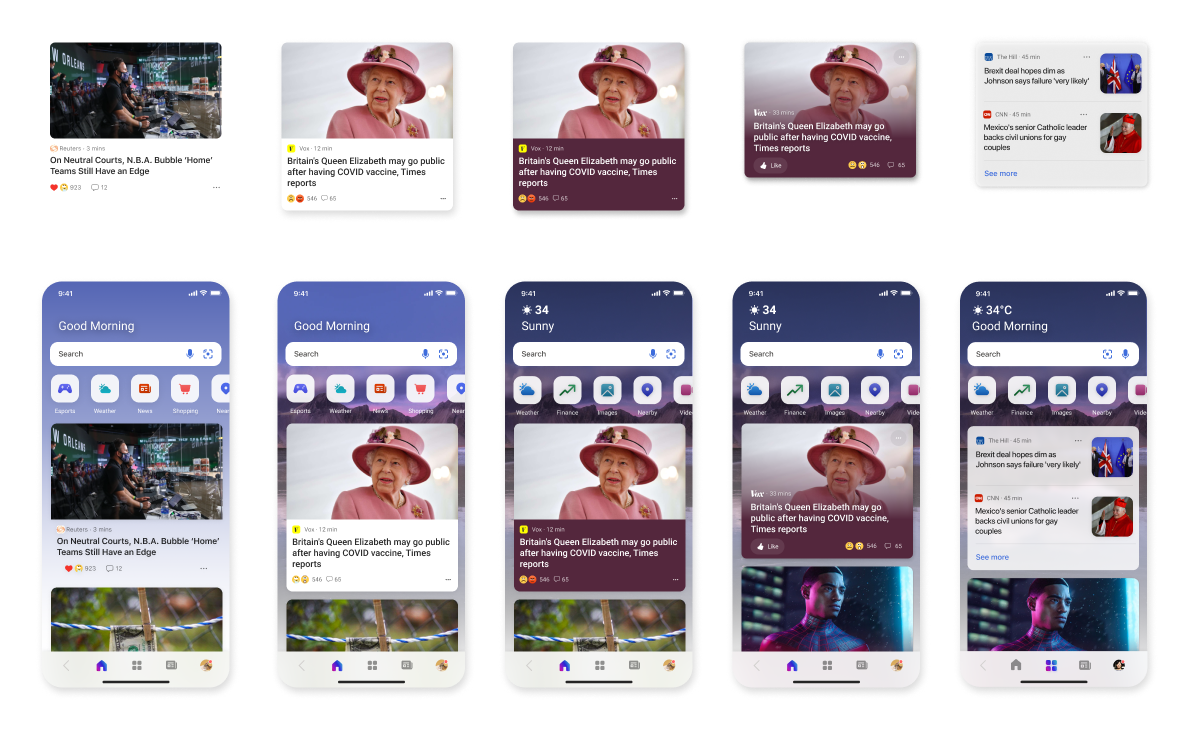
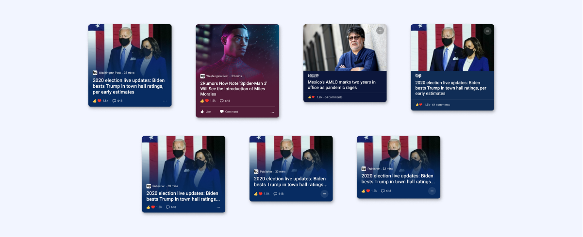
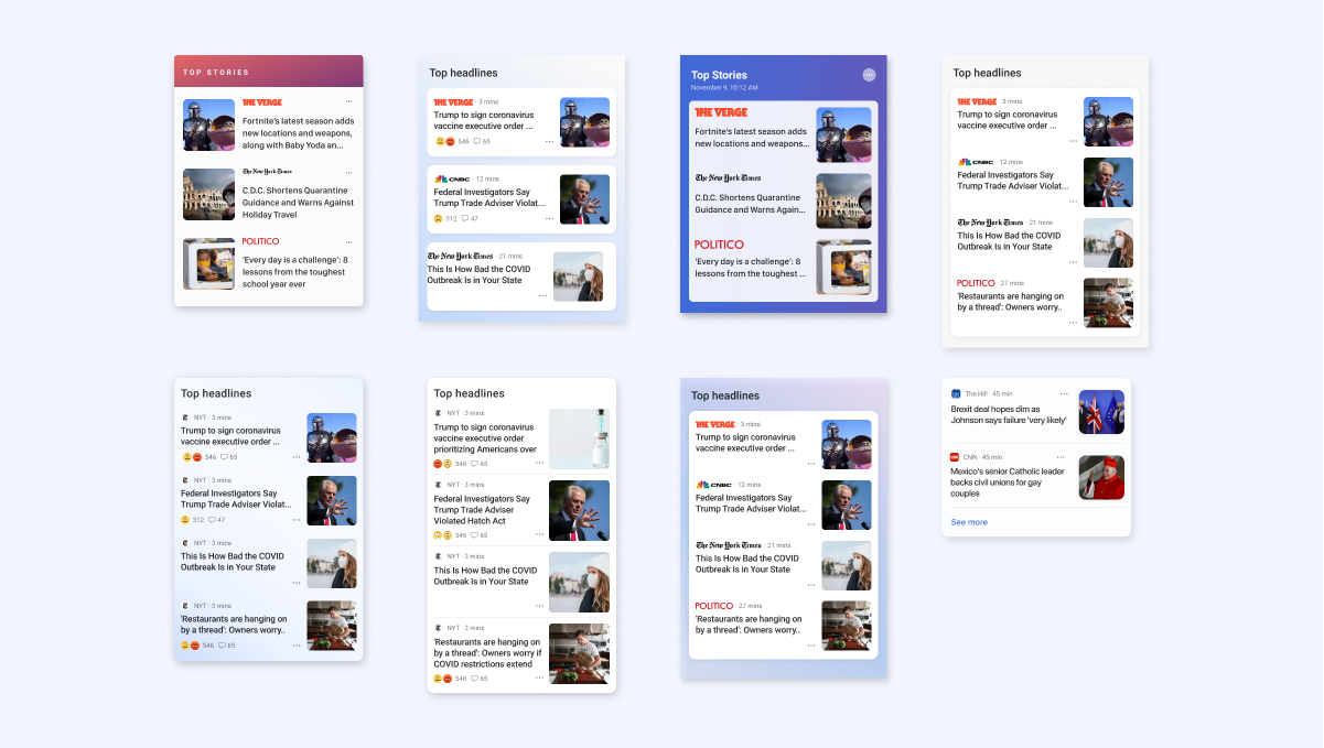
One of the key considerations for this project was desktop alignment. Having consistency in card elements benefits the user experience across platforms and reinforces the brand. Regardless, the mobile experience is unique and mobile user patterns were taken into consideration for the card builds. Below are explorations for the primary homepage news cards.
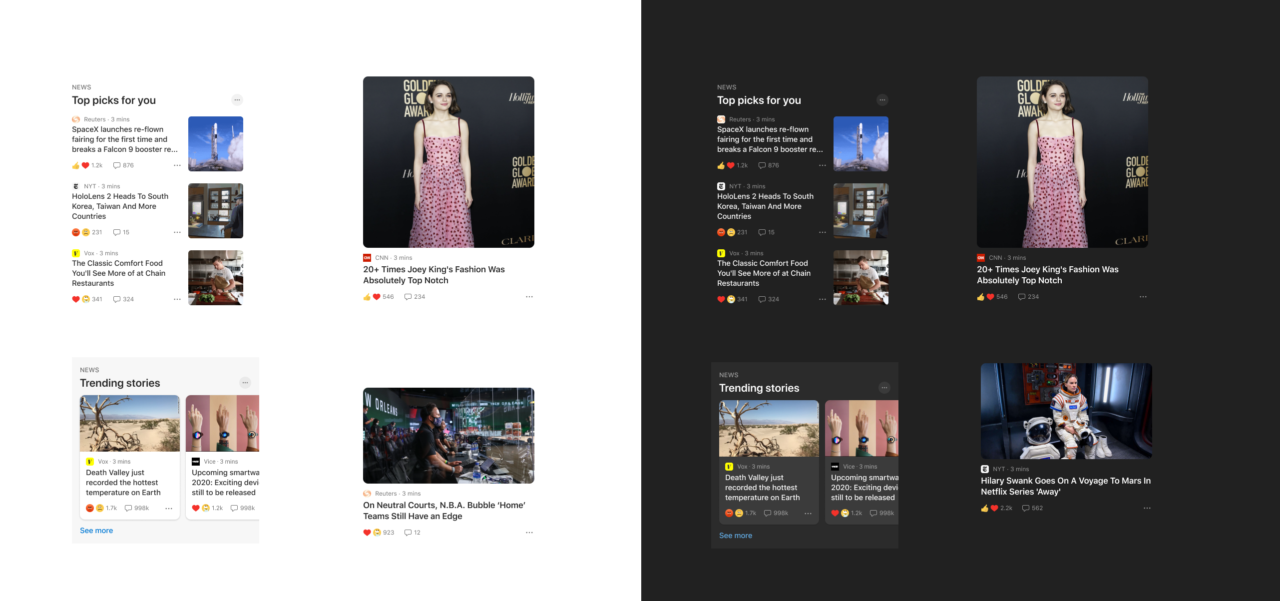
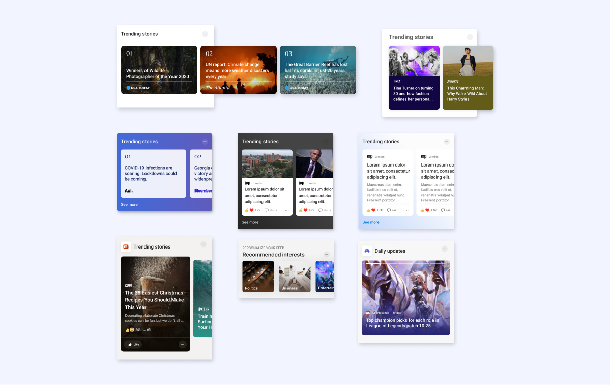
UI diversity allows for a variety of content from trending stories, to highlights from news categories such as weather and sports, to sponsored content and advertising. Below are some explorations for other types of cards and content implementation.
The final set of cards include variation in size and content presentation maintaining individuality and working as a visual family. The design includes both light and dark mode options.
Homepage explorations
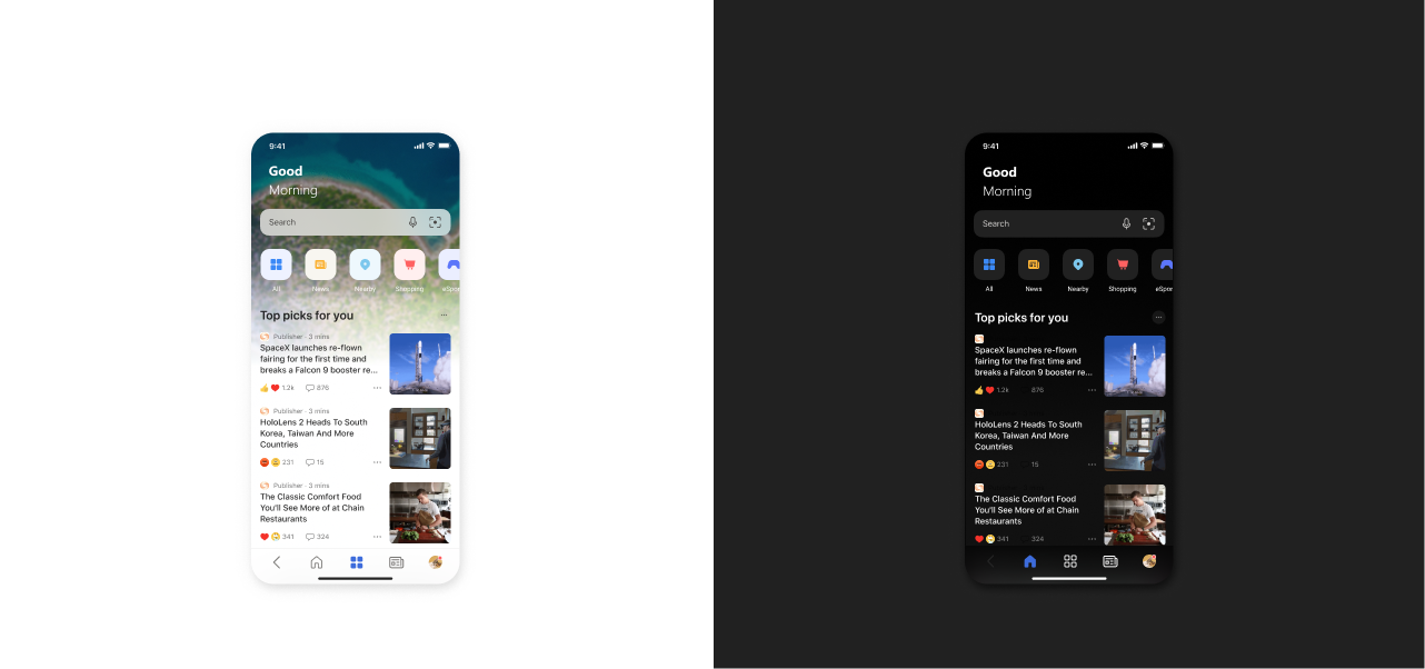
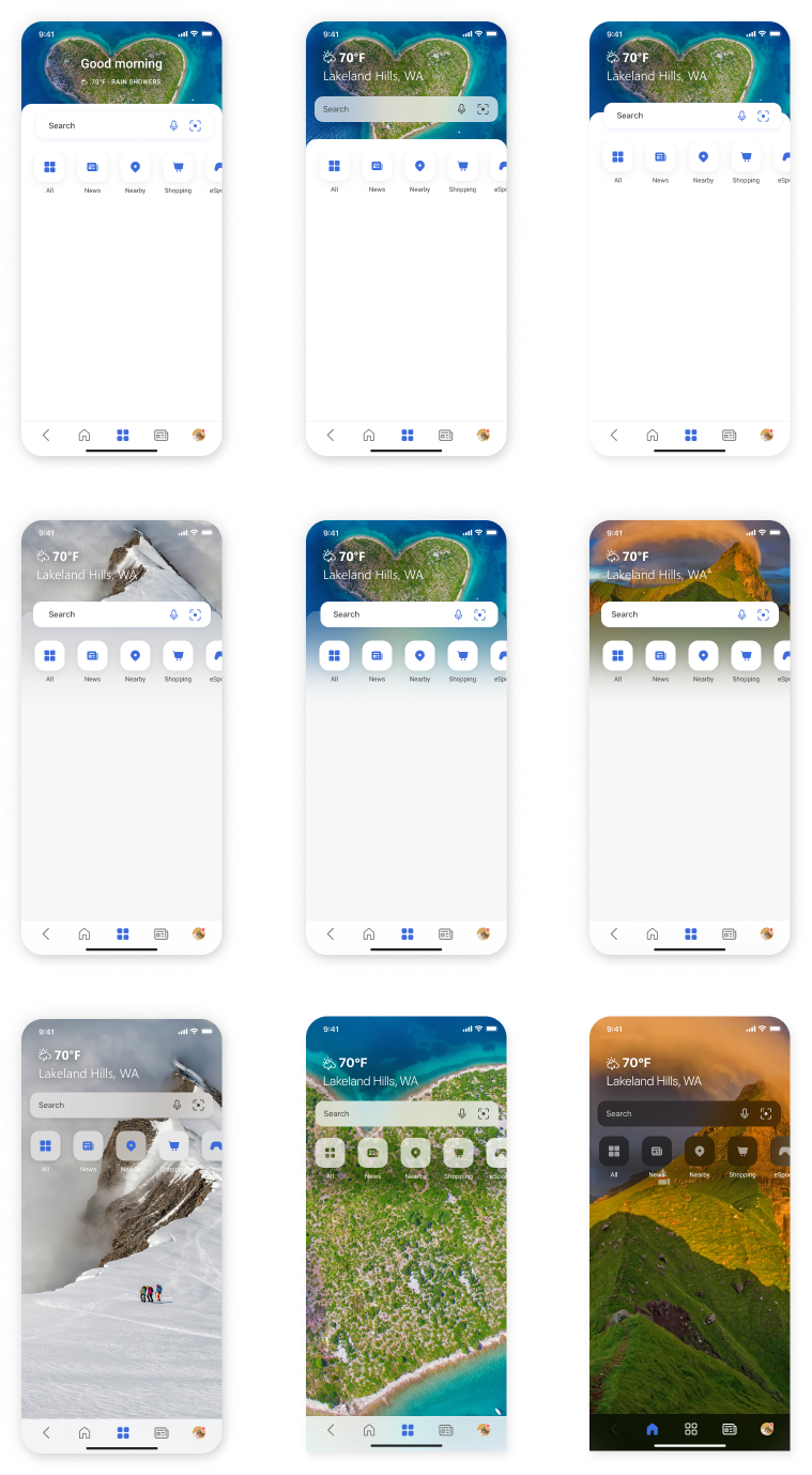
The design above shows the homepage layout before updates. The design needed to catch up with desktop style updates as well as address accessibility issues where the image and text overlap and in the mini-app tile design.
The lead designer for this project prepared the updates for the homepage layouts and explored several design options. I contributed to a few explorations.
Mini app explorations
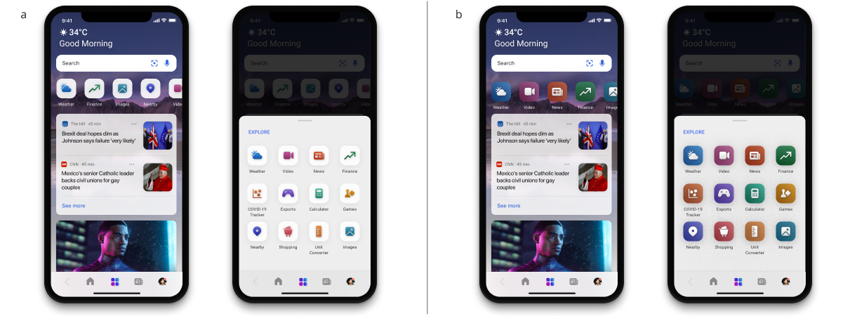
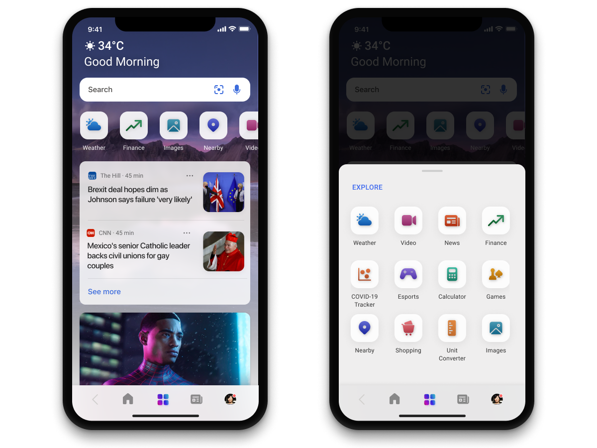
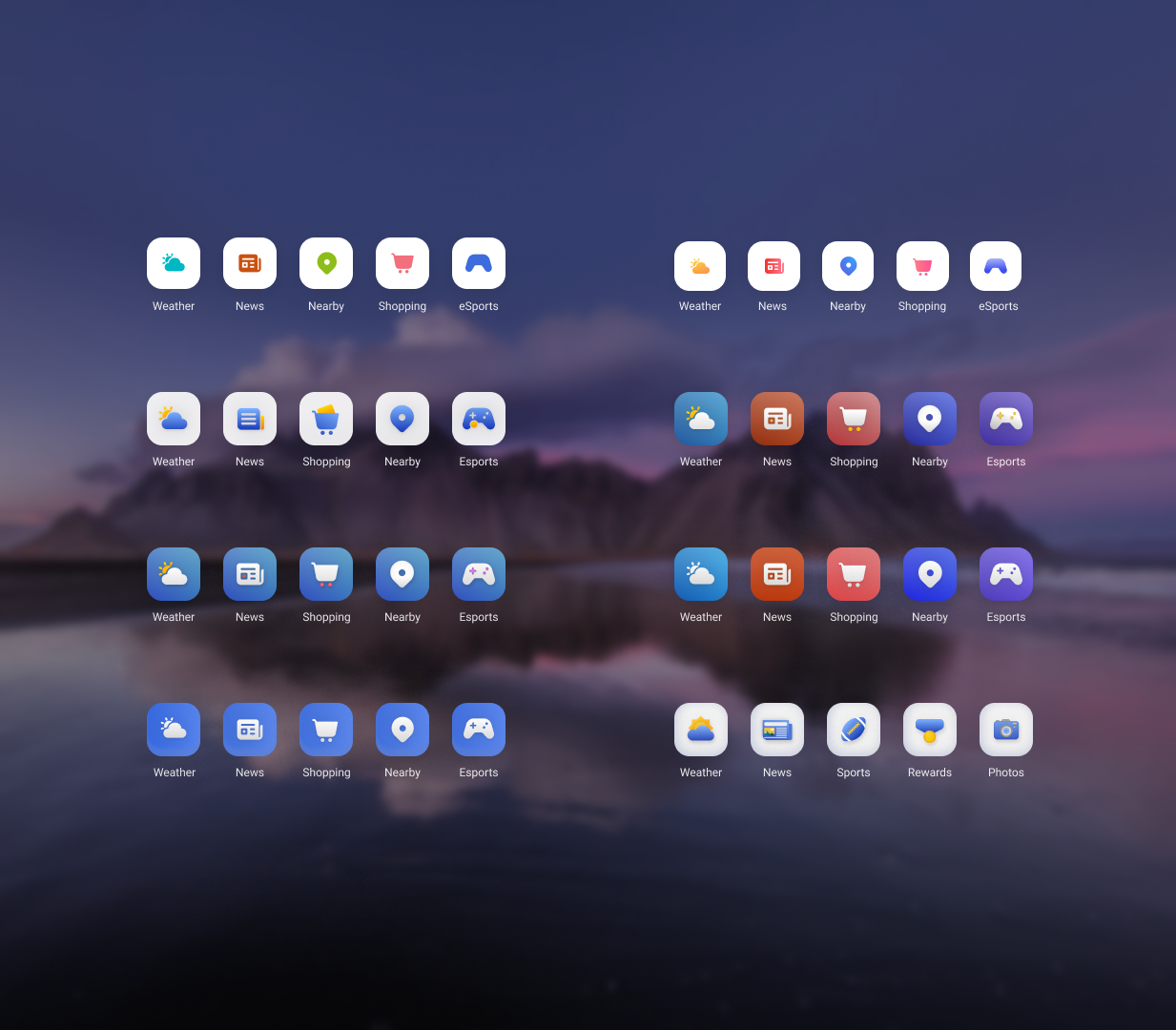
Like the cards, one of the goals for the mini-app tile design was to be more visually expressive. I explored color, illustration style, color contrast for accessibility, icon size, and shadow effects. This visual design needed to both enhance and blend with the overall design. We moved forward with two options and performed a small a/b study that showed more interest in the ‘a’ option.
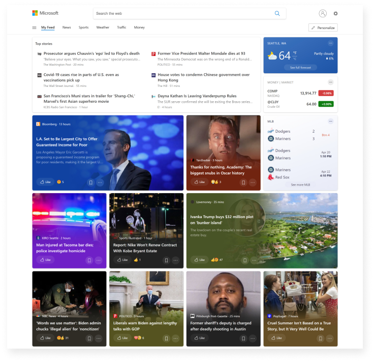
The new cards, page layout, and mini-app tiles make up the complete design for the homepage update. The example feed shows a sampling of varied content in light and dark modes.
Next Steps
The iterative evolution for this project is continued after these early explorations. See these updates and more from other contributors.
